| BPI has a
new product called the BPI RGB Spectrometer™, which is in fact a colorimeter:
a device which measures and characterizes color as it appears to an
actual observer, according to a mathematical model of color vision. The subject of colorimetry is dauntingly complex, but in a nutshell it can be described as follows:
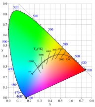
The white light and every possible combination of the three primary colors form a color space. There are as many color spaces as there are people willing to choose filters and measure the results. A good color space would include every color people can see (none of them do that), with no duplicates (no combinations that result in the same color as some other combination; most spaces are good about that), and no "imaginary" colors (numerical combinations that make sense mathematically but don't actually correspond to a visible color; some color spaces have imaginary regions). When someone talks about the RGB value of a color, he or she is specifying the percentage of red, green and blue from a particular set of filters that matches the color in question, starting with an understood light source. The BPI RGB Spectrometer™ has a light source, which we have chosen because it covers most of the visible spectrum, and a set of filtered sensors, which give the red, green and blue readings. The light and filters are chosen so that the sensors don't respond to invisible wavelengths (infrared and ultraviolet). Chaos So far, that's what all of this sounds like. The color space of your TV set doesn't match your printer. Your CRT monitor has a different space from the LCD monitor. Color film covers a different space from digital cameras, but that's OK because the digital camera doesn't use the same space as the monitor or printer that you view its pictures on. And on top of that, BPI has its own quirky color space for its colorimeter. There are thousands of color spaces, or anyway a dozen or so that people actually use. Fortunately, the color response of the eye is more or less linear: if you shine two lights with certain RGB values into someone's eyes, you get the same response as if you used one light with an RGB that is the sum of the original RGB's. That means that the RGB measurements of one color space can be translated into another space, within limits. Even more fortunately, starting in the 1920's, the CIE (Commission Internationale de l'Eclairage -- the International Commission on Illumination) began the work of standardizing color measurements based not on color filters but on matching eye responses to monochromatic light with mixtures of monochromatic primaries. This led to the 1931 CIE XYZ standard measurements, in which X represents a proportion of the red side of the spectrum, Z is the blue side of the spectrum, and Y is the proportion of a color that matches the photopic efficiency function of the standard observer. When RGB measurements from different color spaces are translated into XYZ space, everyone is comparing oranges to oranges. But How Do I Draw It? The
three-dimensional representation of color is nice, but people like to
visualize things in two dimensions, so they can be printed in a book.
Since
Y in
the XYZ
system represents the overall color-weighted sensitivity
of the standard observer's eyes (we're all pretty standard, aren't
we?), there is a clever transformation which can be used to describe
color in two dimensions separately from "brightness." That way, a dark
green can be the same color
as a bright green: it differs only in how much
of the color reaches your eyes. This system is known as xyY space (keep
your eye on the capital letters), and the coordinates x and y together
define chromaticity,
while Y defines luminosity.
Specifically, we define x=X/(X+Y+Z)
and y=Y/(X+Y+Z).
In the
two-dimensional xy
space, the x-axis describes colors varying between
blue and red as x
varies from 0 to 1, and the y-axis describes colors
going from blue to green as y
varies from 0 to 1. In xy space, the gamut of all possible visible colors forms a "horseshoe" shape, with the perfectly monochromatic colors along the outer edge and the less saturated colors in the interior. The horseshoe is usually drawn with the wavelengths of monochromatic light marked on the edge and some (inferior) approximation to the color of each point on the inside based on the ability of your printer or monitor to display colors. There is also usually a special curve drawn into the horseshoe, called the "black-body curve," which is the color of a glowing incandescent object as it is heated to ever higher temperatures. Notice that the black-body curve is extended to temperatures that no real object could ever achieve without vaporizing. One Last Complication If you study the xy horseshoe, you will notice that it has an awful lot of green, whereas the reds and blues seem to be squeezed into the corners. The sensation of color difference is not constant: if you pick pairs of points the same distance apart in different parts of the diagram, the perceived color difference won't be the same. For some purposes, it would be nice to be able to simply measure the distance between two color points and use that distance to describe the feeling of color difference. That's why there is yet another set of color coordinates known as the CIELAB space. In this space, the number L* varies from 0 to about 100 and represents a sensation of "lightness". The number a* varies from about -100 to +100 and represents the change from green to red. The number b* varies from about -100 to +100 and represents the change from blue to yellow. For example, if (a*,b*) is:
|